
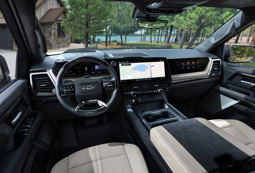
The newest trucks from General Motors are getting a completely redesigned user interface. For most car companies throughout the past decade, this kind of redesign would typically mean one thing: bigger screens. But sitting in the driver’s seat of a preproduction version of one of these trucks, there’s just as much to push, turn, and click as there is to see.
Coming to the 2027 Chevrolet Silverado 1500 and 2027 GMC Sierra 1500 when they roll off the production line later this year, GM’s new in-cabin user interface is not the screen overload many have come to bemoan. Instead, it’s a carefully balanced blend of analog buttons and knobs and minimally configured screens intended to focus on only the most important information. It’s an approach that GM plans to expand across its portfolio.
“There’s this economy that I wanted to really make sure that we expressed in the interface,” says Sebastian Bauer, GM’s head of human interface design. “What are the things that we need, what are the things that are important in any given context you’re in, and really starting to surface that at the right moments and in the right way.”
This new user interface, in the works for the past two years, has been shepherded and refined by Bauer. He joined GM in June 2025, after 15 years working on human interface design at Apple and Google. Bauer is a self-declared car guy, born and raised in Munich but based in the U.S. for more than 30 years. Before GM, his career was focused more on traditional consumer technology, the kind that can fit on a screen or in a hand. Now in the larger scale of the automotive world, Bauer says many of the same design principles apply.
“At Apple, I really learned about rigor,” Bauer says. “You may think people don’t notice, but they do. And even if they can’t point it out, it’s a feeling. And so that emotionality, that connection that you have, it really comes from the attention to detail. It comes from rigor, and that’s something that I’ve very much taken away from that experience and brought here.”
GM’s new user interface shows this tech industry influence, with screens that blend into the dash rather than jutting out, and a thin line of analog controls for common tasks like adjusting the volume or the temperature. The screens spread over 60 inches in three separate spaces in this new user interface but none of them overwhelms the driver’s view. One, an infotainment screen directly in front of the passenger seat, is filtered to be completely invisible to the driver.
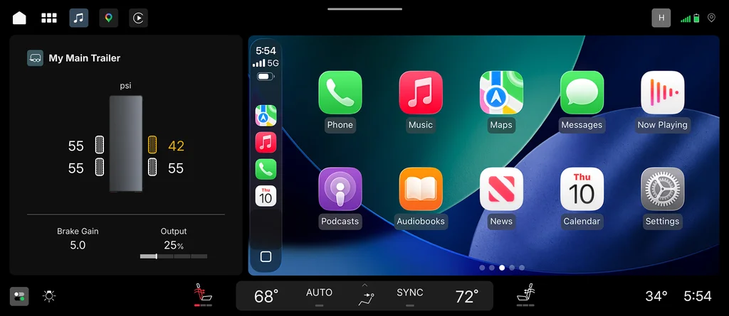
More important than the amount of screen space is what gets displayed on them. Bauer says his team spent a lot of time winnowing down what needs to show up on the truck’s screens, and how long it takes to get to the features needed most by GM’s truck customers. The screens are programmed to display a streamlined amount of information and settings compared with user interfaces of the past. The main cluster shows primarily the speedometer and tachometer, with second-tier information like time and temperature displayed much smaller. The larger center screen has been pared down to show two of the most commonly used interface programs: navigation and, in a smaller section on the side, the truck’s music controls.
‘Like rooms in a house’
Parked next to the Design building in GM’s Technical Center outside Detroit on a recent morning, Mike Wahlstrom, executive director of vehicle product engineering, flicks through a range of the main features in the user interface. This ranges from taking a phone call, to using Google Gemini’s voice-controlled AI, to finding directions for setting up the truck to trailer a boat. He says paring down the center screen’s default display was a big divergence from the user interfaces of the past, most of which have been flooded with an iPhone-like grid of apps.
“We’re trying to get you the information you need or the experiences you need without having to feel like you need to go find something,” he says. “We talk about it like rooms in a house where you don’t want to feel like you’re going into one room and then the next room and the next room, but more like an open concept where you can see everything and get to everything as quickly as you can.”
Bauer says the user interface redesign required some balancing of new approaches and old standards. Simplifying the interface was important, but he was careful not to eliminate too much, or replace too many common elements with novel treatments. “That creates cognitive load,” Bauer says. “I want to make sure that there is a connection point and that we make use of those neurological pathways and the muscle memory that people already have. Why rip them out of that?”
GM also took a risk building this new user interface for its full-sized truck category, which represents about a third of all GM sales annually. But Bauer says the wide variety of uses among truck customers—from hauling boats to pushing snow plows to truck cabins acting as offices on construction sites—meant the user interface had to be ready for almost anything. That means it can easily be altered to fit in other cars across GM’s portfolio.
“It is scalable, it is adaptive, it allows us to make sure whether it’s going to be a performance vehicle or a utility vehicle or a luxury vehicle, that the experience really suits the context of the car,” Bauer says.