
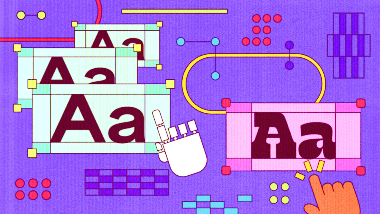
Anthropic has just announced Claude Design, a tool that lets teams generate and iterate visual design outputs through natural-language prompts. On the surface, it’s hard not to like the proposition: competent layout and typography on demand, fewer blank-page moments and faster shipping for everything from landing pages to pitch decks.
When it comes to typography, it will make design faster, easier and cheaper. The problem is that it also makes design more likely to converge, because it defaults to what works: what’s legible, familiar and proven. In other words: safe, usable, generic.
That genericness isn’t just an aesthetic issue. It reduces recognition, makes brands easier to imitate, and forces you to shout louder just to be remembered, to rely more heavily on media spend to get noticed. A study by JKR and Ipsos a few years ago showed that only 15% of brand assets tested were truly distinctive. That lack of distinctiveness erodes pricing power, forcing brands to compete on price rather than value. According to Kantar, difference is the most critical factor of what allows brands to charge a premium in their category. In a world where the barriers to brand building are lower than ever, where competition is fierce and consumer attention increasingly fleeting, you can’t afford to look like everyone else; in fact, distinctiveness is crucial in driving growth.
The good news is that this is also a huge opportunity: if AI pushes more brands toward the same “good enough” defaults, the brands that invest in real typographic distinction will stand out faster.
Typography is brand infrastructure. It has to behave consistently across products and platforms, scale globally, support multiple languages and become synonymous with the brand over time. That’s exactly why it’s such a leverage point: sharpen the type system and you sharpen a huge number of touch points at once.
The problem with prompts
This is not an argument against using tools like Claude Design for typography. These tools give brands very usable, free fonts (usually sans-serif) – essentially a useful baseline for type.
But when it comes to creating a distinctive asset that will last over time, using a tool that only draws on a small pool of familiar patterns and widely available fonts won’t cut it. It will lead to a proliferation of brands whose typography is essentially a derivate of the most popular free fonts, that are loaded billions of times and appear on millions of websites.
As I write this, Roboto was served 63.1 billion times over the past week, appearing on more than 410 million websites. Imagine choosing a logo knowing it’s shared by millions of other brands. We’d never accept that level of sameness for a mark, yet typography often gets a pass, even though it does much of the ‘heavy lifting’ on many brand touchpoints.
Where to start with custom type
Ultimately, Claude Design is a welcome wake-up call – to pay more attention to the power of custom typography. This doesn’t mean that all brands should invest in a 100-style type family. A startup might go for a distinctive headline cut while using a solid retail face for body copy. A scale-up might license a retail font and customise just a few key glyphs, enough to make the system more ownable.
The point is to think about what a custom typeface could be for your brand and explore different routes to type distinctiveness. You can create a ‘logo font’ that becomes recognisable even without the mark (think how some brands can be identified from a headline alone, like Dunkin).
Or take distinctive features from existing assets and bake them into letterforms; small details that quietly connect everything back to the brand. Walmart’s Everyday Sans, for example, is a bespoke type family designed to balance expression with function. Its shapes are sleek and modern while retaining some unique quirks and characteristics of the wordmark – such as distinctive teardrop counter shapes, strong diagonals and elongated circular forms.
You can also be deliberately different: a typographic voice with strategic grounding (warmth, intelligence, rebellion, craft) even if it doesn’t visually echo anything else. Mailchimp’s Means, for instance, is a “friendly” serif that perfectly encapsulates the brand’s quirky personality – in Mailchimp’s words, “Smart but not stuffy. Goofy but definitely aced its SATs”.
Shifting the advantage to originality
So yes, use AI to explore and accelerate. But place human judgment where it counts: building a typographic system with durability and ownership. If everyone has access to the same tools, distinctiveness becomes such a clear advantage.
We’ve already been living through a ‘sans-demic’: a slow convergence over the past 20 years where brand typography has become increasingly interchangeable, simply because it’s deemed effective. Look at the headline type for some of the world’s largest companies (Apple, Uber, Pinterest et al.). Strip away the logo and color and you can’t tell them apart. No distinction, no character.
Ironically, AI design tools might be the thing that finally ends this affliction; by making distinctiveness more impactful than ever.