

The Salt Lake City Olympics planned for 2034 are now the Utah Games after organizers announced a new logo and name to reflect the multi-community work that goes into hosting the largest winter sports event on Earth. The state’s Governor, Spencer Cox, says the new logo has united people—though not in a good way.
“It’s really brought people together because everyone seems to not like it,” Cox said at a recent press conference.
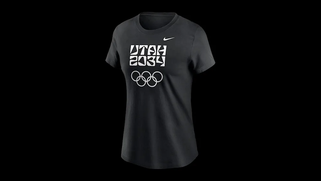
The new logo is temporary until the final emblem of the Games is released in 2029. It spells out “Utah” in irregularly shaped characters (does that say “IJTAH?”) that are stacked on top of “2034.” Its launch color palette is just black and white.
Cox called the logo bold. “I’m a little old-fashioned and it’s certainly a bold logo,” he said. The comment section of one local Utah news site included reviews like “beyond terrible,” “a marketing disaster,” and “unreadable.” Some don’t like the name change that leaves out Salt Lake City. “It hurts,” Salt Lake County Mayor Erin Mendenhall told The Salt Lake Tribune.
A starting point, not a finish line
This bare-bones logo, though, is just the beginning of what will become an expansive visual brand expressed across venues, apparel, and more. It’s a starting point, not a finish line.
“I think that Olympics are uniquely a moment to do something new and different. And yet, many Olympics have bland and forgettable design,” Doug Thomas, an associate professor at Brigham Young University’s Department of Design and author of Never Use Futura, tells Fast Company. “Personally, I like that the Utah 2034 design team are swinging for the fences and trying something new and memorable.”

Utah organizers say the International Olympic Committee (IOC) allows for “transition logos” to “help the host regions build early awareness and momentum,” but they’re limited to typography only.
The Utah 2034 mark, then, is a chance to introduce shapes through letters and numbers alone, the beginnings of a geometric visual language that could one day be revealed in a full Olympics brand expression.
Just as the “Chrystal Rhythm” pattern of the 2002 Salt Lake City Games appeared in the snowflake-like Chrystal logo and was repeated across assets like venue signage and the iconic jackets worn by volunteers, the shapes in the letterforms of the Utah 2034 mark could well be repeated in future expressions of the brand.
“The typography is recognizable, it is distinctive, and as such, opens space to create new meaning,” Thomas says. “The visual forms may not work in every application, but for a transition team logo, this is excellent as a starting point.”
Brand inspiration
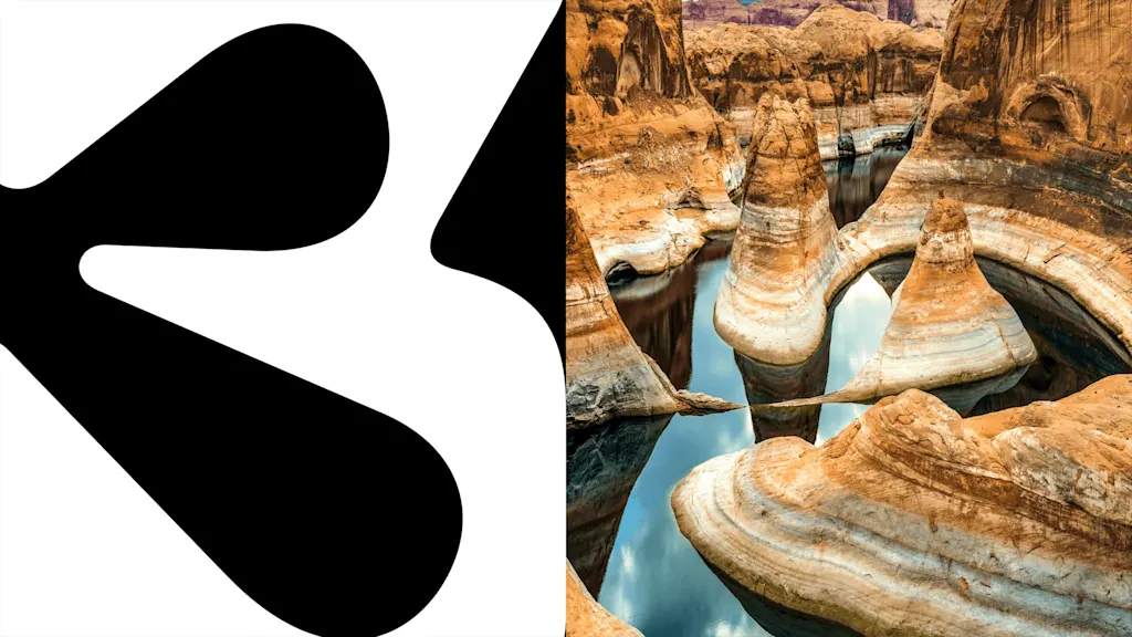
Organizers say the shapes of the letters in the logo were inspired by Utah’s landscape. It’s most noticeable in the stylized A designed to evoke southern Utah’s Delicate Arch. Other characters were drawn to resemble rivers, mountains, canyons, and petroglyphs, and one can imagine these same angles and shapes showing up in Olympic pictograms that denote sports and venues.
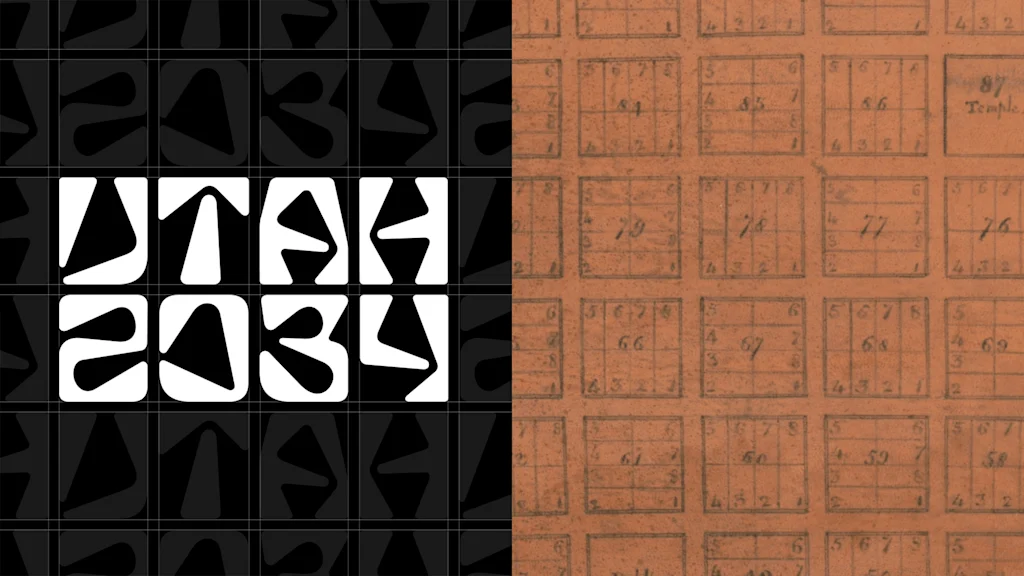
The letterforms are monospaced and laid out on a grid. Inspired by the urban grids that Mormon pioneers laid out in cities across Utah and the American West in the late 1800s, it gives the otherwise unusual logo a sense of balance. The logo was designed by a project team led by Molly Mazzolini, cofounder of the Salt Lake City design studio Elevate Creative.
As for the name change, Salt Lake shouldn’t take it personally. Cox, the governor, says naming the Games for Utah instead of Salt Lake City was a decision made following decades of feedback from other cities and counties in the Salt Lake metro area that also hosted events during the 2002 Games but didn’t get credit. But it’s also aligned with the recent trend of Winter Olympics naming themselves after multiple cities or a region instead of a single city. The 2026 Milano Cortina Games are named for both Milan and Cortina d’Ampezzo in Italy as they’re being held across a wide region, and they 2030 Games are named for the French Alps.
In Utah, where events will be held from Provo to Park City, organizers are going with the state name. And by embedding the geography of Utah into the very letters of their new logo, designers found a creative way to begin telling Utah’s story in just a few characters.