
When people post infographics on their Instagram accounts, they’re sharing information and facts about the world with their followers. They’re also trying to convey something about the kind of person they are by distributing these aesthetically pleasing, digestible bites of data. Perhaps they want to make a statement about their own politics or conscientiousness.
So what is the Museum of Modern Art revealing about itself as an institution with its forthcoming exhibit Full Disclosure: The Edge of Information Design?
The pieces of information design in the exhibition “tell us the fact that the museum is always ready to understand what’s important to the world in that particular moment, and to try to give the best examples of it,” says Paola Antonelli, the senior curator of architecture and design at New York City’s MoMA, during a walkthrough of the exhibit as she and her team prepared it for its opening on September 27. “Having an exhibition about information design shows that we’re continuing our mission to talk about the art in our time, of our time.”
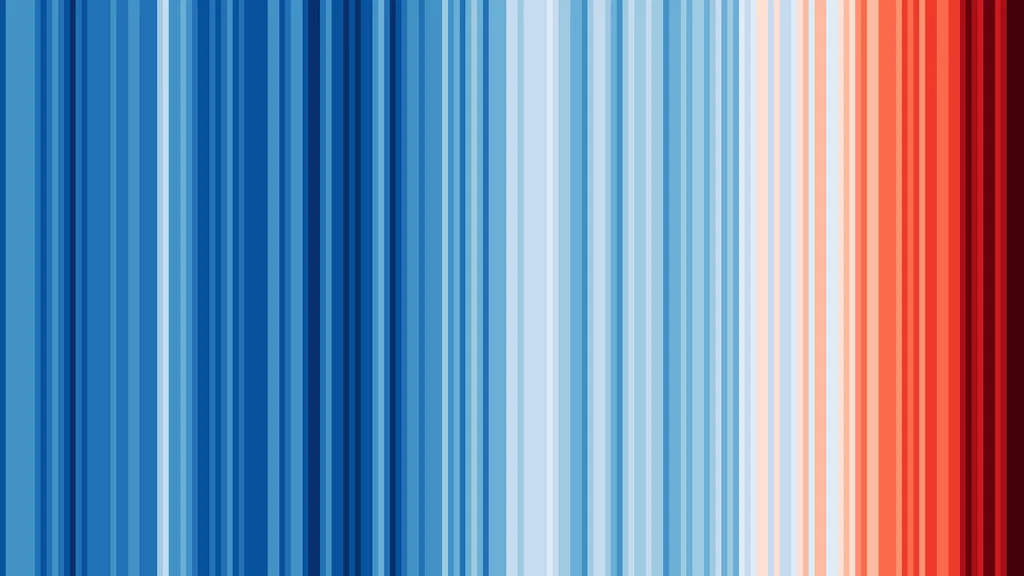
The first piece that visitors will see upon entrance through the museum is Warming Stripes, by climatologist Ed Hawkins, who “wanted to find a way to drill it in people’s brains that global warming is really happening.” The stripes, which over the course of the work go from a deep blue to a bright red, represent the average temperature of each year. The imagery resembles a gorgeous rug—and also a huge warning sign.
To Antonelli, Warming Stripes is an ideal distillation of information design, because the field “takes phenomena big and small, public and intimate, complex, scientific, and statistically more superficial, and renders them in a way that is comprehensible by a wide audience.”
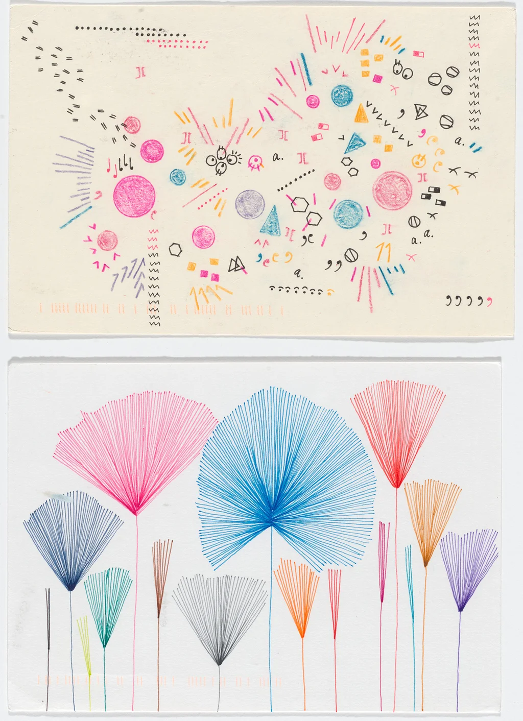
The exhibition shows that information design is not limited to weaving huge data sets into legibility. One portion of Full Disclosure focuses entirely on personal data, and includes a correspondence between artists Giorgia Lupi and Stefanie Posavec. In what became their Dear Data project, the two found creative ways to visualize how many times they cursed in a week, for example. The idea is that the practice of information design can help people connect in a more personal or even playful way with the many nuggets of data that have come to symbolize their lives.
MoMA has been collecting works of information design since 2008, when Antonelli debuted an exhibition called Design and the Elastic Mind, which focused on the ways designers have adapted to revolutionary scientific change. As part of her curation, she encountered “all of these different designers that didn’t really have a home,” who worked with data visualization, she says. “I kind of hugged them up.” All but one of the pieces in this exhibition are part of MoMA’s collection.
Often, the origination of information design as a practice gets traced back to the invention of the bar chart or Dr. John Snow’s 19th-century map of cholera in London. But Antonelli sees it going back way further—it has always been a part of the human experience because “it’s all about explaining things in a narrative and visual way.” That means cave drawings displaying the haul of deer from a hunt fit the bill, too.
But the use of computers and digital tools has exploded and expanded the practice of information design. And the exhibition reflects that.
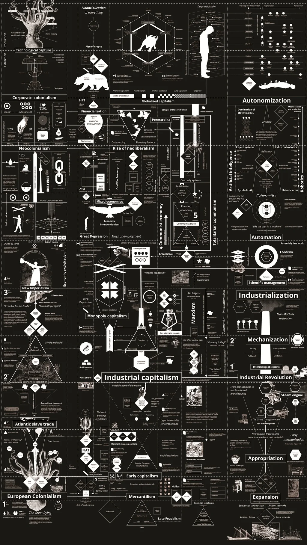
While many people encounter examples of information design on tiny phone screens, and there are ample opportunities to interact with screens in this exhibition, it also includes massive pieces that take up entire walls or, in the case of Kate Crawford and Vladan Joler’s Calculating Empires, one room.
Newspapers and media companies often have teams focused on information design, and two works from The New York Times are included in the exhibition—one that uses 3-D rendering to explain why Paris’s Notre Dame cathedral was so vulnerable to fire and another that recreates the Greenwood neighborhood destroyed by the Tulsa race massacre.
Antonelli sees the museum’s first-ever exhibition focused entirely on information design as a “gentle provocation,” or perhaps a “surprise” reminder that everyday works—say, those found in a newspaper—are museum-worthy.
She wants visitors to leave with a better sense of discernment for the barrage of infographics and diagrams they’ll encounter each day. She hopes they’ll use their own critical sensibility to see how the creator’s choice of color, typeface, or other formal decisions might impact how a viewer sees what it’s trying to represent. And she’d like people who see these design examples to have a keener sense of appreciation for when something has been done “elegantly and efficiently.”
“We’re hoping that, as usual, they will look at their life with different eyes,” Antonelli says. “More critical eyes.”