
A lot has changed at Turion Space since it was founded in 2020. Originally focused on space debris removal, the Irvine, California-based company has since transformed into a space infrastructure company, building the vehicles, software, and payloads that help spacecraft move, maneuver, collect data, and carry out missions in orbit.
That evolution has also changed the scale of the opportunities it is pursuing. Turion has moved from proving its technology to competing for major government programs and taking on increasingly complex missions, alongside both established aerospace and defense contractors and newer space companies.
Turion’s growth coincides with a broader shift in the space industry. In the U.S., major government programs are increasingly bringing commercial and emerging space companies into the fold alongside established contractors, creating a competitive landscape for companies like Turion.
In that evolving landscape, the team at Turion realized that their brand hadn’t quite kept pace with their progress. The original identity took cues from Turion’s early focus on space debris removal, with a literal orbital motif built into the wordmark. As the company expanded into mission software, space logistics, and other capabilities, the navy-on-white, corporate-leaning identity could no longer reflect the breadth of its work.
Sid Fritts, former head of marketing and brand at Turion Space, says the team wanted to go “beyond the generic space-defense identity so many companies in this category default to.” To lead the rebrand, Turion called on the creative chops of Buck and Wild—both part of Residence, a global network of independent creative companies—to reimagine its identity, brand world, and website. Together, the teams quickly identified a few tensions: Turion’s story had to strike a balance between its present and its future. Turion already has two satellites in orbit, so its identity needed to hold its confidence and credibility while also making room for its aspirations.
“Our long-term vision, Starforge—an ambition to build infrastructure for deep-space missions and resource extraction—can come across as a pipe dream to some customers, a distraction from the mission at hand,” says Fritts. “But that misreads what it is: the result of compounding capability, where each product line we ship today builds directly toward it.”
As Fritts adds, achieving this balance meant creating a system that seamlessly scales from the micro to the macro. “The same brand has to carry a spec sheet for a mission operator and a thesis about the next hundred years in orbit, and both have to feel like the same company,” he notes.
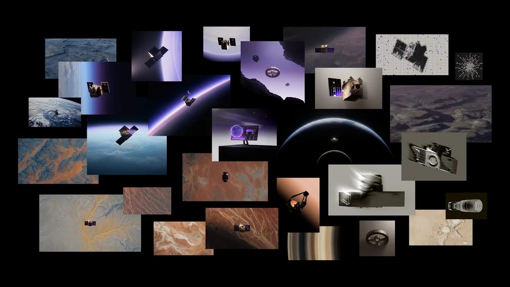
There was another challenge at hand, too. Turion wanted its identity to spark a sense of optimism about space, but much of its work cannot be shared publicly—a constraint that can push defense brands towards vague, interchangeable identities. The team needed to show off Turion’s products and engineering in realistic detail, “while also finding clever ways to hide or redact the proprietary (or even government-classified) bits,” says Mike Payne, creative director at Buck, which developed the visual identity, while Wild translated it into the new web experience. “High-contrast, focused lighting, and careful consideration of framing were key in this.”
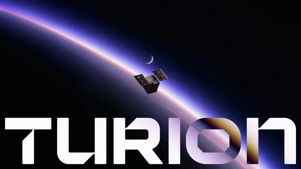
The new brand had to encapsulate a hopeful vision of the space economy that extends beyond defense, as the industry increasingly brings national security and commercial applications together. For Buck, that meant visualizing that glint of collective curiosity we all share about space. “We found the solution was just giving our renders a touch of nostalgia—a subtle sense of atmosphere, warm lighting, blooming in the highlights,” Payne says. “It all adds a thin glaze of otherworldly dreaminess that pulls you in like a tractor beam.”
This visualization also presented an opportunity for Turion to set itself apart as it continues to grow in a competitive landscape. Its selection for the Space Force’s RG-XX program, for instance, put it in the same playing field as Lockheed Martin, Northrop Grumman, and L3Harris alongside newer space companies such as Anduril Industries, Astranis, and True Anomaly.
Space branding is known to be mired in tired tropes: nostalgic NASA-worm retro-futurism, sterile blue-gradient defense corporate, and gritty industrial blight. “None of them fit us,” says Fritts, Turion’s former marketing head. Besides, stock photos of bright objects floating through the void “aren’t exactly inspiring any excitement,” adds Payne, the Buck creative director.
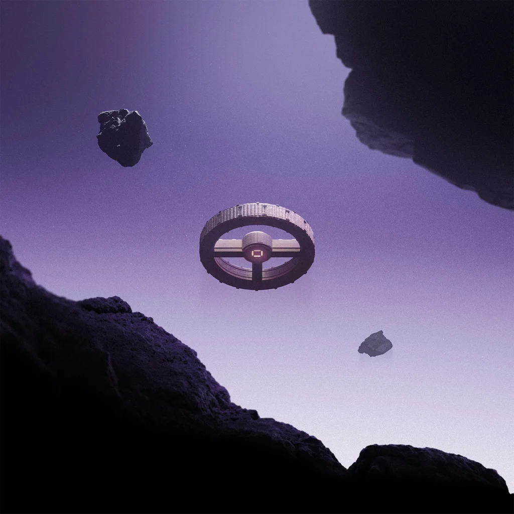
Buck decided to flip the script. Instead of treating space as a black vacuum, it brightened the backdrops, awash in a purple haze, bringing space itself center stage. This brought a deeper sense of scale and atmosphere. “It helped ground the brand in a visionary and yet tangible and believable version of space,” Payne says. The color palette added to that effect: The luminous purple helped bring warmth to the otherwise cold and sterile landscape of space branding, signaling a different way of looking at space.
The visuals are best experienced on the website, where scrolling itself becomes a storytelling device. “The scroll journey carries you from the ground, real missions, real hardware, real numbers, into something closer to zero gravity: a subtle parallax that lets elements drift and settle independently, giving the page a weightless, floating quality the deeper you go,” says Eva Landaluce, creative lead at Wild. “By the time you reach Starforge, the site itself feels like it’s in orbit.” It’s true. Further down the page, asteroids and spacecraft emerge, gently bobbing, as if untethered from gravity.
That same attention to detail extends to the more functional parts of the identity. Buck fine-tuned the wordmark and created a square-based pixel grid drawing on the square terminals of Funnel Display, the primary typeface chosen by Turion. Elsewhere, ASCII-style art allowed them a way to visualize things that are otherwise difficult to show—software, data, functionality, or proprietary technology that cannot be photographed or rendered directly.
Ultimately, Turion’s identity captures the tension at the heart of the company: serious engineering grounded in the present, and an imagination firmly pointed toward the future. “We can have fun while delivering serious products,” Fritts says. “There’s a part of Turion’s DNA that will always embrace science fiction and big dreams, and this brand finally lets that show.”