Close Menu
    Facebook X (Twitter) Instagram
    TRENDING :
    • Target’s new retro-inspired Pokémon collection was made for superfans, by superfans
    • The future of AI in schools isn’t personalized learning
    • How new perspectives come from moonwalking
    • Snap layoffs today: 16% of jobs cut as CEO Evan Spiegel is the latest to tout AI advances
    • With 7 short words, the CEO of United Airlines just taught a brilliant lesson in leadership
    • Disney begins laying off 1,000 employees. Here’s who will be affected
    • Quantum computing stocks are back on the rise. Here’s why IONQ, QBTS, RGTI, and QUBT are up
    • Hungary 3rd Time A Charm?
    Populist Bulletin
    • Home
    • US Politics
    • World Politics
    • Economy
    • Business
    • Headline News
    Populist Bulletin
    Home»Business»Frank Lloyd Wright’s ‘Fallingwater’ is too iconic for a logo
    Business 3 Mins Read

    Frank Lloyd Wright’s ‘Fallingwater’ is too iconic for a logo

    Business 3 Mins Read
    Share Facebook Twitter Pinterest LinkedIn Tumblr Telegram Email Copy Link
    Follow Us
    Google News Flipboard
    Share
    Facebook Twitter LinkedIn Pinterest Email


    Fallingwater, the iconic Pennsylvania home architect Frank Lloyd Wright designed to sit over a running stream, just rebranded. But it doesn’t have a logo, and that’s intentional.

    “A logo’s purpose is to provide a cognitive shortcut to brand essence—but Fallingwater’s iconic elements, the cantilevered house and its landscape, are too rich to compress graphically, yet too essential to abstract,” says Amy Blackman, founder of L.A. design firm Fruition Co., that worked on the rebrand which went live last week, said in a statement.

    [Photo: Carol Highsmith/Unsplash]

    The new brand also comes with updated fonts and an expanded color palette that was inspired by nature and the natural materials used to build the house. But Fallingwater was “un-logoable,” she says, because the house itself is one.

    “That iconic view of the house floating over the falls is the power of our visual identity,” Fallingwater director Justin Gunther said. “When you try and distill that image into a graphic depiction, it doesn’t do it justice.”

    Wright designed the home in 1935 for Edgar Kaufmann Sr., a Pittsburgh department store owner, and today it’s a museum and UNESCO World Heritage List site that draws about 140,000 visitors annually and runs a gorgeous, calming livestream on YouTube of its iconic falls all year long.

    Past Fallingwater logos used the distinctive shape of the building’s rectangular block facade over the falls to depict it literally. Some used more realistic representation of the home while others were abstract, like one made from brush stroke lines.

    The Fallingwater logo mark in all caps, dark red text over a gray background.
    [Logo: Fallingwater.org]

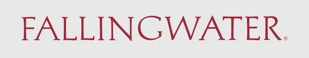
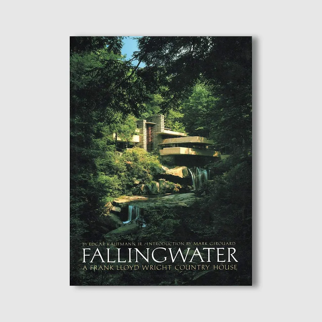
    Instead of trying to represent that famous POV of the house over its namesake falling water in a new way, the solution was a wordmark. The new Fallingwater logo spells out the home’s name in a customized version of Aldus Roman, a serif typeface designed for books. It was also used on the 1986 book cover for Fallingwater: A Frank Lloyd Wright Country House by Edgar Kaufmann Jr., about his family’s home. There’s also a shorthand “FW” favicon to make it more adaptable for small spaces like browser tabs.

    [Cover Image: Fallingwater.org]

    The wordmark was adapted from the book cover, according to Fallingwater, and some letters were subtly edited to make them look more flowing, like the Ls, which received curves on their tails, and the added tilt to the W.

    “When shown together with the house, it serves to reinforce the qualities of the design,” Gunther says. “And when alone, it serves to evoke that image in our minds.”

    Fallingwater is just the latest Wright-associated group or property to abandon a visual identity based on a building. The Frank Lloyd Wright Building Conservancy recently abandoned a representative logo that depicted a single building in Buffalo for a square logo that symbolized Wright and the importance of preserving his work.

    Fallingwater’s new wordmark stays out of the way and let the famous architecture speak for itself.


    Source link

    Share. Facebook Twitter Pinterest LinkedIn Tumblr Email

    Related Posts

    Target’s new retro-inspired Pokémon collection was made for superfans, by superfans

    April 15, 2026

    The future of AI in schools isn’t personalized learning

    April 15, 2026

    How new perspectives come from moonwalking

    April 15, 2026
    Top News
    Business 2 Mins Read

    Northern lights tonight: Don’t miss your chance to catch a visible aurora borealis in 19 states. Here’s the forecast for where and when

    Business 2 Mins Read

    The Northern Lights, also known as aurora borealis, may be visible in nearly 19 U.S. states tonight,…

    An Open Letter to Congressional Republicans of Conscience

    January 30, 2026

    Why Silicon Valley’s vision of the future is broken—and how to fix it

    November 1, 2025

    Spirit Christmas is back with 30 pop-up stores: Full list of locations for your holiday shopping needs

    November 7, 2025
    Top Trending
    Business 6 Mins Read

    Target’s new retro-inspired Pokémon collection was made for superfans, by superfans

    Business 6 Mins Read

    When Pokémon launched in 1996, the brand offered just a pair of…

    Business 6 Mins Read

    The future of AI in schools isn’t personalized learning

    Business 6 Mins Read

    At first blush, it sounds too good to be true: a learning…

    Business 5 Mins Read

    How new perspectives come from moonwalking

    Business 5 Mins Read

    I had a student visit my office hours recently looking for career…

    Categories
    • Business
    • Economy
    • Headline News
    • Top News
    • US Politics
    • World Politics
    About us

    The Populist Bulletin was founded with a fervent commitment to inform, inspire, empower and spark meaningful conversations about the economy, business, politics, government accountability, globalization, and the preservation of American cultural heritage.

    We are devoted to delivering straightforward, unfiltered, compelling, relatable stories that resonate with the majority of the American public, while boldly challenging false mainstream narratives that seem to only serve entrenched elitists, and foreign interests.

    Top Picks

    Target’s new retro-inspired Pokémon collection was made for superfans, by superfans

    April 15, 2026

    The future of AI in schools isn’t personalized learning

    April 15, 2026

    How new perspectives come from moonwalking

    April 15, 2026
    Categories
    • Business
    • Economy
    • Headline News
    • Top News
    • US Politics
    • World Politics
    Copyright © 2025 Populist Bulletin. All Rights Reserved.

    Type above and press Enter to search. Press Esc to cancel.