
Close Menu
    Facebook X (Twitter) Instagram
    TRENDING :
    • Does Staten Island Explain the Trump Age?—With Ben Naddaff-Hafrey
    • Trump’s $500 ACA ‘refund’ checks won’t make a dent in rising healthcare costs
    • BYU Football Injury Report: TCU Road Trip Looms
    • Symphony Space Launches First Orbital Creative Studio for Brands
    • Mississippi Top 10 Shakeup: Who Lost Their Ranking Spot
    • Meet the Mulleted MIT Dropout Behind Meta’s Hit AI App Muse
    • Jackson Area Football Rankings: Week 8 Tumbles Revealed
    • Social media safeguards for kids are finally in motion. Will AI protections take just as long?
    Populist Bulletin
    • Home
    • US Politics
    • World Politics
    • Economy
    • Business
    • Headline News
    Populist Bulletin
    Home»Business»CNBC replaces its peacock with . . . a triangle
    Business 2 Mins Read

    CNBC replaces its peacock with . . . a triangle

    Business 2 Mins Read
    Share Facebook Twitter Pinterest LinkedIn Tumblr Telegram Email Copy Link
    Follow Us
    Google News Flipboard
    Share
    Facebook Twitter LinkedIn Pinterest Email


    CNBC and its sister networks, including USA, Golf Channel, and E!, are spinning off from their former parent company Comcast NBCUniversal to form a new publicly traded company called Versant. As part of the new company, some of the brands in the portfolio have to rebrand to get rid of NBC’s iconic Peacock mark, CNBC included.

    CNBC’s new logo, which goes live December 13, might take viewers some time to get used to.

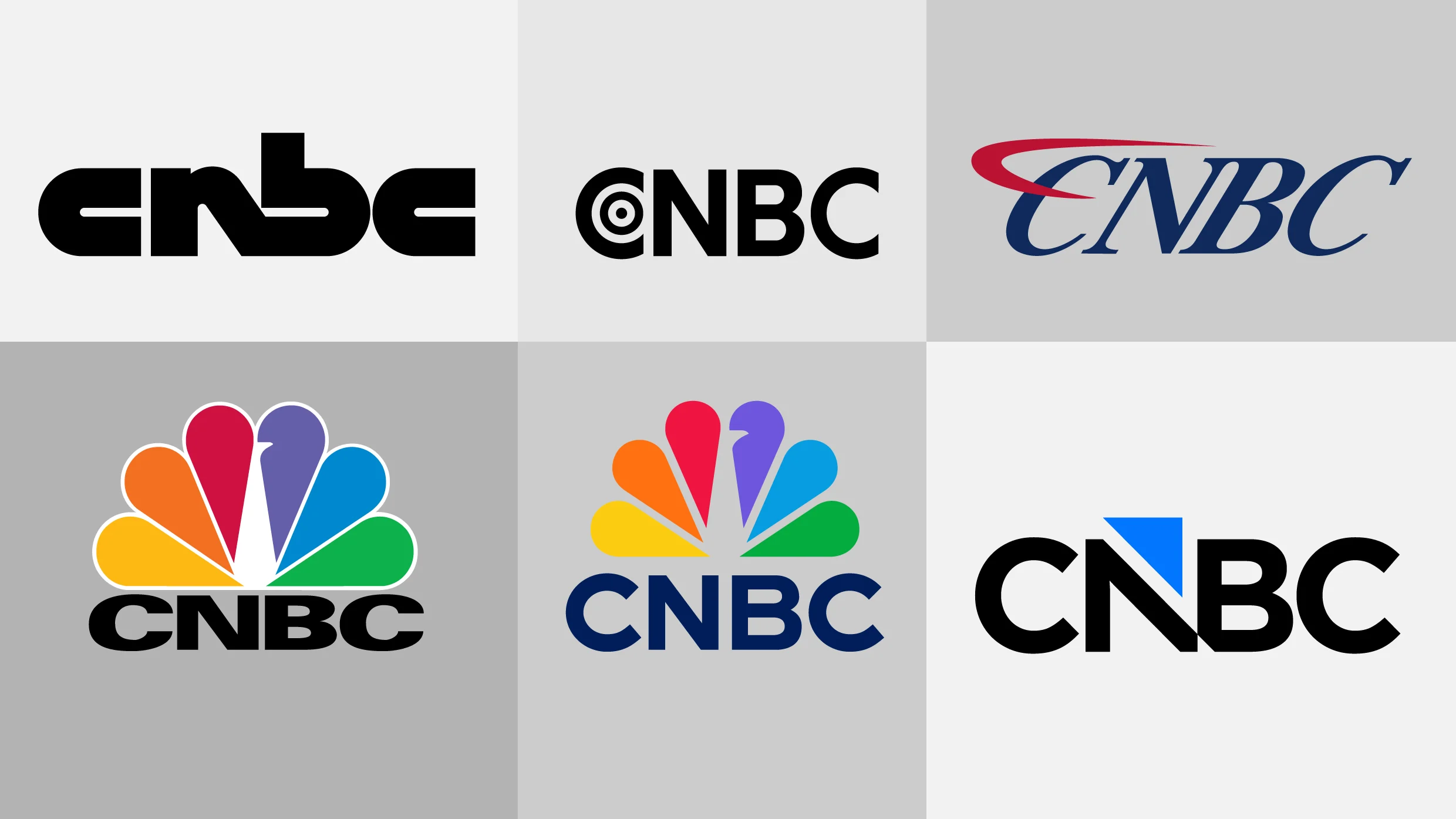
    CNBC’s logo evolution, 1989–present. [Images: CNBC]

    The financial news network’s new logo was designed in house to easily match the preexisting visual assets it uses on air. The typography of the mark based is on the network’s font, Gotham, and it shows a triangle cutting into the letter N and floating just above the wordmark. That triangle, which the network calls an arrow, matches its on-air graphics package.

    The triangle shape has been used by CNBC since 2023. It’s shown next to stocks to indicate which companies are up in green and which are down in red, and it appears as an icon displayed next to on-air chyrons like “Earnings Report.” The colors used in the new logo match the the dark “Broadcast Blue” and light “Neon Blue” already used in the network’s primary color palette.

    The new logo is meant to reflect a modern, streamlined identity, CNBC says, but the initial reaction online to the new logo hasn’t exactly been positive. In one Reddit thread, complaints ranged from “generic” and “corporate-looking” to being bothered by the triangular notch at the bottom of the N and B. “The triangle represents a guillotine blade, killing the brand,” one wrote. On X, a commenter asked if it was a joke.

    Though the peacock is gone, CNBC is betting that by sticking to its arrow and wordmark it will be able to maintain the strength and recognition of its name brand with its audience even with a new look.


    Source link

    Share. Facebook Twitter Pinterest LinkedIn Tumblr Email

    Related Posts

    Trump’s $500 ACA ‘refund’ checks won’t make a dent in rising healthcare costs

    October 5, 2026

    Symphony Space Launches First Orbital Creative Studio for Brands

    October 5, 2026

    Meet the Mulleted MIT Dropout Behind Meta’s Hit AI App Muse

    October 5, 2026
    Top News
    US Politics 9 Mins Read

    Hakeem Jeffries Is the Kind of Democrat Voters Have Lost Faith In

    US Politics 9 Mins Read

    Politics / September 16, 2025 With most New York Democrats endorsing their party’s candidate for…

    Clawdbot/Moltbot/OpenClaw is cool, but gets pricey fast

    January 30, 2026

    Reese’s Peanut Butter Cup inventor’s grandson says the candy has gotten worse in this specific way. Social media agrees

    February 19, 2026

    ‘Woke is back’ on social media following Mamdani victory

    November 7, 2025
    Top Trending
    US Politics 2 Mins Read

    Does Staten Island Explain the Trump Age?—With Ben Naddaff-Hafrey

    US Politics 2 Mins Read

    Ad Policy Staten Island seen in New York City on August 5,…

    Business 4 Mins Read

    Trump’s $500 ACA ‘refund’ checks won’t make a dent in rising healthcare costs

    Business 4 Mins Read

    Last week, the Trump administration began sending $500 checks to roughly 1…

    World Politics 1 Min Read

    BYU Football Injury Report: TCU Road Trip Looms

    World Politics 1 Min Read

    BYU football is preparing for a critical road matchup against TCU while…

    Categories
    • Business
    • Economy
    • Headline News
    • Top News
    • US Politics
    • World Politics
    About us

    The Populist Bulletin was founded with a fervent commitment to inform, inspire, empower and spark meaningful conversations about the economy, business, politics, government accountability, globalization, and the preservation of American cultural heritage.

    We are devoted to delivering straightforward, unfiltered, compelling, relatable stories that resonate with the majority of the American public, while boldly challenging false mainstream narratives that seem to only serve entrenched elitists, and foreign interests.

    Top Picks

    Does Staten Island Explain the Trump Age?—With Ben Naddaff-Hafrey

    October 5, 2026

    Trump’s $500 ACA ‘refund’ checks won’t make a dent in rising healthcare costs

    October 5, 2026

    BYU Football Injury Report: TCU Road Trip Looms

    October 5, 2026
    Categories
    • Business
    • Economy
    • Headline News
    • Top News
    • US Politics
    • World Politics
    Copyright © 2025 Populist Bulletin. All Rights Reserved.

    Type above and press Enter to search. Press Esc to cancel.