
Close Menu
    Facebook X (Twitter) Instagram
    TRENDING :
    • This 3D model captures a rare tropical glacier before it’s gone
    • Kevin O’Leary believes his 10,000-acre data center can be ‘beautiful’
    • America’s HOAs are broken. This startup is trying to fix them
    • 10 Best Open Source Bookkeeping Software Options
    • The hidden gap between how others see you and what you’re worth
    • Your workforce doesn’t need more AI. It needs play
    • The Real Reason Russia Would Invade Europe
    • 5 Key Differences Between LLC C Corp and S Corp
    Populist Bulletin
    • Home
    • US Politics
    • World Politics
    • Economy
    • Business
    • Headline News
    Populist Bulletin
    Home»Business»A brief history of Calibri, the ‘woke’ font the Trump administration is replacing
    Business 4 Mins Read

    A brief history of Calibri, the ‘woke’ font the Trump administration is replacing

    Business 4 Mins Read
    Share Facebook Twitter Pinterest LinkedIn Tumblr Telegram Email Copy Link
    Follow Us
    Google News Flipboard
    Share
    Facebook Twitter LinkedIn Pinterest Email


    Calibri and Times New Roman have been at war for years. And now the two fonts are once again pitted against each other after the U.S. State Department declared it will be swapping its current official typeface, Calibri, for Times New Roman. It’s a full circle moment, considering the State Department ditched Times New Roman for Calibri in just 2023.

    Secretary of State Marco Rubio wrote that switching to Calibri was “wasteful” and “achieved nothing except the degradation of the department’s official correspondence” in an internal department memo obtained by Reuters and The New York Times.

    The type designer behind the sans-serif font Calibri calls Rubio’s decision “hilarious and regrettable.”

    Lucas de Groot designed Calibri in 2007 specifically for readability on computer screens. The width and curvature of its simple letterform was optimized to be easy to read, and it replaced Times New Roman as the default font in Microsoft Office in 2007 (before being replaced by Apotos in 2023).

    In 2023, the State Department decided to replace Times New Roman with Calibri for all official communications and memos. It was a bid for greater accessibility throughout the organization. At the time, then Secretary of State Antony Blinken said, Times New Roman “can introduce accessibility issues for individuals with disabilities who use Optical Character Recognition technology or screen readers.”

    Not everyone was happy about the decision, but de Groot believes it was the right choice.

    “There were sound reasons for moving away from Times,” de Groot tells Fast Company in an email. “Calibri performs exceptionally well at small sizes and on standard office monitors, whereas serif fonts like Times New Roman tend to appear more distorted.”

    [Animation: FC]

    A DEI typeface

    In the cable, sent with the subject line “Return to Tradition: Times New Roman 14-Point Font Required for All Department Paper,” Rubio called Calibri “informal” and said it “clashes” with State letterhead. He also criticized it as a “radical” diversity, equity, inclusion, and accessibility initiative.

    Former Secretary of State Antony Blinken made the 2023 change to Calibri at the recommendation of the department’s office of diversity and inclusion due its accessibility and ease to read for people with disabilities. Now it’s getting swept up in Trump’s wider war on woke.

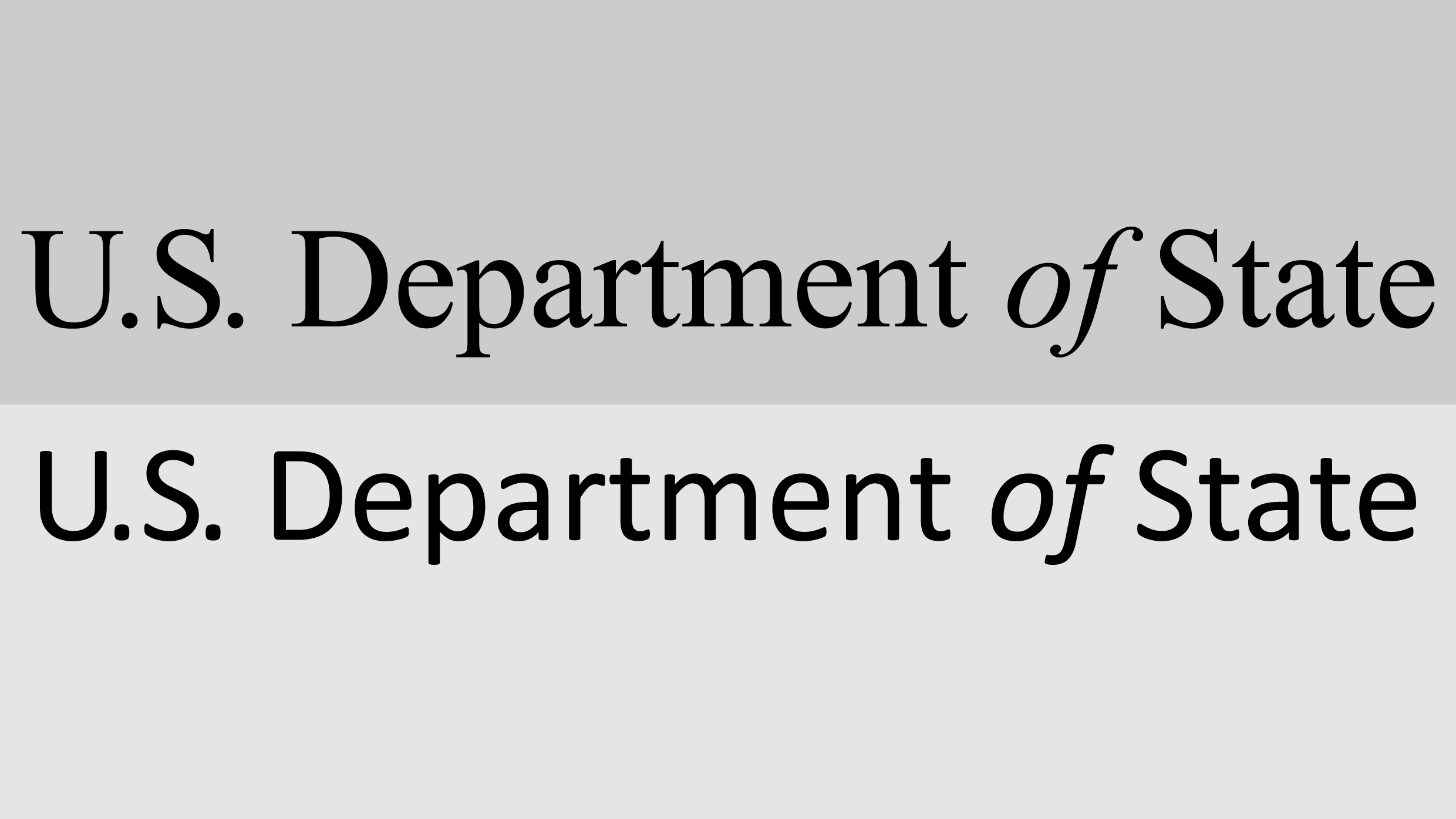
    Times New Roman (top), Calibri (bottom)

    Serif typefaces, with their small feet, or serifs, on the letterform, are sometimes perceived to be more conservative. Meanwhile, some believe that sans-serifs read as more modern and progressive, though that’s far from a hard-and-fast rule. After all, Trump loves a sans-serif font, and Sen. Bernie Sanders’s has leaned into serif typography for his campaign logos.

    “Serif fonts are often perceived as more traditional, but they are also more demanding to use effectively,” says de Groot, noting the spacing is noticeably inconsistent in all-caps Times New Roman in words like “Chicago” and the font appears too thin and sharp when printed at high quality.

    For many readers, though, font preference has less to do with politics than it does personal taste and what they’re used to seeing. There were inter-office complaints when the State Department switched to Calibri that sound an awful lot like normal office grumblings when one has to switch from Slack to Teams.

    “I think the idea that a typeface is woke is kind of ridiculous,” says type designer Jonathan Hoefler, who designed the Biden-Harris typography and is the co-author of Gotham, a typeface that’s now been used by presidential candidates of both parties.

    Typefaces aren’t good or bad, he says. They are simply designed to solve different problems. Times New Roman was designed for newspaper text and Calibri was designed for a screen.

    “None of these are bad typefaces, they’re just designed around their circumstances,” he says.


    Source link

    Share. Facebook Twitter Pinterest LinkedIn Tumblr Email

    Related Posts

    This 3D model captures a rare tropical glacier before it’s gone

    May 31, 2026

    Kevin O’Leary believes his 10,000-acre data center can be ‘beautiful’

    May 31, 2026

    America’s HOAs are broken. This startup is trying to fix them

    May 31, 2026
    Top News
    Business 9 Mins Read

    Dropbox’s head designer is an AI optimist

    Business 9 Mins Read

    AI is part and parcel of many corporate design processes these days, including one company…

    Deepfakes are warping reality. This AI project turns them into a history lesson

    March 18, 2026

    Cable giant Charter is laying off nearly 1,200 employees, source says

    October 22, 2025

    How to Edit Video Clips Step by Step

    November 16, 2025
    Top Trending
    Business 3 Mins Read

    This 3D model captures a rare tropical glacier before it’s gone

    Business 3 Mins Read

    When Klaus Thymann flew nearly 15,000 feet up into Indonesia’s remote highlands…

    Business 6 Mins Read

    Kevin O’Leary believes his 10,000-acre data center can be ‘beautiful’

    Business 6 Mins Read

    If it ever gets built, the 7.5-gigawatt Stratos data center project in…

    Business 7 Mins Read

    America’s HOAs are broken. This startup is trying to fix them

    Business 7 Mins Read

    In 2012, Jonathan Gropper purchased a condo in a historic Philadelphia building…

    Categories
    • Business
    • Economy
    • Headline News
    • Top News
    • US Politics
    • World Politics
    About us

    The Populist Bulletin was founded with a fervent commitment to inform, inspire, empower and spark meaningful conversations about the economy, business, politics, government accountability, globalization, and the preservation of American cultural heritage.

    We are devoted to delivering straightforward, unfiltered, compelling, relatable stories that resonate with the majority of the American public, while boldly challenging false mainstream narratives that seem to only serve entrenched elitists, and foreign interests.

    Top Picks

    This 3D model captures a rare tropical glacier before it’s gone

    May 31, 2026

    Kevin O’Leary believes his 10,000-acre data center can be ‘beautiful’

    May 31, 2026

    America’s HOAs are broken. This startup is trying to fix them

    May 31, 2026
    Categories
    • Business
    • Economy
    • Headline News
    • Top News
    • US Politics
    • World Politics
    Copyright © 2025 Populist Bulletin. All Rights Reserved.

    Type above and press Enter to search. Press Esc to cancel.