
Close Menu
    Facebook X (Twitter) Instagram
    TRENDING :
    • 7 Creative Ideas for Social Engagement Posts to Boost Online Interaction
    • 7 Essential Accounts Every Accountant Should List
    • How to stop procrastinating with just one word
    • 7 Essential Components of a Free Employee Handbook Template
    • 7 Top Franchises You Can Operate From Home in the USA
    • Understanding B2C Sales Meaning: A Beginner’s Guide
    • 10 Key Factors Influencing Equipment Loan Rates Today
    • 5 Simple Steps to Form Your Sole Proprietorship
    Populist Bulletin
    • Home
    • US Politics
    • World Politics
    • Economy
    • Business
    • Headline News
    Populist Bulletin
    Home»Business»James Talarico’s vintage-print-inspired type signals a new political landscape
    Business 3 Mins Read

    James Talarico’s vintage-print-inspired type signals a new political landscape

    Business 3 Mins Read
    Share Facebook Twitter Pinterest LinkedIn Tumblr Telegram Email Copy Link
    Follow Us
    Google News Flipboard
    Share
    Facebook Twitter LinkedIn Pinterest Email


    Texas state Representative James Talarcio won Tuesday’s Democratic primary for U.S. Senate, but his campaign’s real mission is even more ambitious. “We are not just trying to win an election. We are trying to fundamentally change our politics,” Talarico said during his election night speech in South Austin, where he touted the more than 28,000 volunteers the campaign recruited and the impressive amount of funding it raised without taking money from corporate PACs.

    It’s a message his campaign isn’t just saying with words, but with the letterforms that shape them, too. Talarcio won the primary with typography that’s intentionally imperfect.

    Contemporary political typography tends toward fonts that are loud and bold, especially when it comes to campaign logos. Those used for candidates like President Donald Trump and former Vice President Kamala Harris set their last names in all-caps, sans-serif typefaces that could be read clearly and at a distance, like an athlete’s surname on the back of a jersey. In contrast, the Talarico campaign’s visual identity looks a little rough around the edges.

    [Screenshots: Talarico for Texas, taylorpenton.com]

    The politician’s primary campaign slogan, “Talarico for Texas,” is far from precision set. It’s subtle at first, but upon closer inspection, you’ll notice that the letters’ strokes aren’t straight (most evident in the letter C, which has an especially uneven weight). And where another designer might have used clean and crisp Texas Lone Stars, this wordmark features rounded, ornamental asterisks to set apart “For Texas.”

    Talarico’s black-and-white palette recalls the one used for former Texas Congressman Beto O’Rourke’s 2018 campaign for a U.S. Senate seat, but their approaches to typography are different. O’Rourke’s type was tall and condensed. Talarico’s looks handmade.

    A secondary “Talarico for Texas” logo arranges the words within the shape of a letter T. It uses slightly different but still notably imperfect typography that draws a contrast to previous political branding standard bearers. Whereas then-presidential candidate Barack Obama’s iconic, corporate-style “O” logo was geometric, balanced, and precisely designed, the “O” in “Talarico” is not at all perfectly round.

    Talarico deploys that look at scale with Birdie, a handmade, vintage-print-inspired typeface by designer Taylor Penton, who says on his website that he designed the font to be “a little off.” Those slight imperfections have proven popular. Penton calls Birdie the “most-used, most-downloaded, and least-regretted font” he’s ever released. Neither Penton nor the Talarico campaign responded to a request for comment.
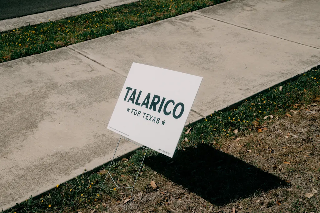
    A photo of a "Talarico for Texas" yard sign.
    [Photo: Jordan Vonderhaar/Bloomberg/Getty Images]

    Overall, the effect of the typography gives Talarico’s campaign brand voice a sense of humanity. This type wasn’t whipped up by a computer, it suggests, but made with a human touch. It’s not unlike the hand-drawn logo New York City Mayor Zohran Mamdani’s campaign used last year, which was inspired by city street signs and Bollywood movie posters. In Talarico slogans like “It’s Time to Start Flipping Tables”—a Biblical reference about righteous moral outrage toward the sins of the Trump administration—the type style gives the letters life.

    Talarico is running to change politics as we know it, and much like Mamdani and Alexandria Ocasio-Cortez before him, he’s doing it with typography that doesn’t look like typical political branding. As campaigns have grown more digital, fonts that feel analog can help candidates communicate authenticity through type.


    Source link

    Share. Facebook Twitter Pinterest LinkedIn Tumblr Email

    Related Posts

    7 Creative Ideas for Social Engagement Posts to Boost Online Interaction

    May 31, 2026

    7 Essential Accounts Every Accountant Should List

    May 31, 2026

    How to stop procrastinating with just one word

    May 31, 2026
    Top News
    Business 4 Mins Read

    Here’s the meeting planning magic trick Google Calendar is missing

    Business 4 Mins Read

    Imagine you need to organize a meeting with people in Portland, Tokyo, and Sydney at…

    How to go from a small business to a fast-growing company

    March 1, 2026

    This adorable Gap ad needs to be a full TV series

    October 8, 2025

    An influential article that called Monsanto’s Roundup safe for humans has been retracted 25 years later

    December 6, 2025
    Top Trending
    Business 10 Mins Read

    7 Creative Ideas for Social Engagement Posts to Boost Online Interaction

    Business 10 Mins Read

    If you want to improve online interaction, consider implementing various creative social…

    Business 11 Mins Read

    7 Essential Accounts Every Accountant Should List

    Business 11 Mins Read

    Every accountant must maintain seven crucial accounts to effectively track a company’s…

    Business 10 Mins Read

    How to stop procrastinating with just one word

    Business 10 Mins Read

    Below, Jon Acuff shares five key insights from his new book, Procrastination…

    Categories
    • Business
    • Economy
    • Headline News
    • Top News
    • US Politics
    • World Politics
    About us

    The Populist Bulletin was founded with a fervent commitment to inform, inspire, empower and spark meaningful conversations about the economy, business, politics, government accountability, globalization, and the preservation of American cultural heritage.

    We are devoted to delivering straightforward, unfiltered, compelling, relatable stories that resonate with the majority of the American public, while boldly challenging false mainstream narratives that seem to only serve entrenched elitists, and foreign interests.

    Top Picks

    7 Creative Ideas for Social Engagement Posts to Boost Online Interaction

    May 31, 2026

    7 Essential Accounts Every Accountant Should List

    May 31, 2026

    How to stop procrastinating with just one word

    May 31, 2026
    Categories
    • Business
    • Economy
    • Headline News
    • Top News
    • US Politics
    • World Politics
    Copyright © 2025 Populist Bulletin. All Rights Reserved.

    Type above and press Enter to search. Press Esc to cancel.