
Close Menu
    Facebook X (Twitter) Instagram
    TRENDING :
    • Pearl Jam’s Iconic Riff Album Made Fans Wait Two Weeks
    • Dayton Faces Northwestern in Charleston Classic Finale
    • Wendy’s store closures hit close to 100 locations in franchisee downfall: See the latest list
    • Taco Dowler Leaves Montana State With Historic Receiving Records
    • 7 Best Practices for Vendor Relationship Management
    • Mike Evans May Avoid Limited Snap Count Sunday
    • John Wayne’s $11,000 Western Turns 92 – and It Was Shot in Under a Week
    • South County Rolls to Ninth Straight Win as Mona Shores Hits 12
    Populist Bulletin
    • Home
    • US Politics
    • World Politics
    • Economy
    • Business
    • Headline News
    Populist Bulletin
    Home»Business»CNBC replaces its peacock with . . . a triangle
    Business 2 Mins Read

    CNBC replaces its peacock with . . . a triangle

    Business 2 Mins Read
    Share Facebook Twitter Pinterest LinkedIn Tumblr Telegram Email Copy Link
    Follow Us
    Google News Flipboard
    Share
    Facebook Twitter LinkedIn Pinterest Email


    CNBC and its sister networks, including USA, Golf Channel, and E!, are spinning off from their former parent company Comcast NBCUniversal to form a new publicly traded company called Versant. As part of the new company, some of the brands in the portfolio have to rebrand to get rid of NBC’s iconic Peacock mark, CNBC included.

    CNBC’s new logo, which goes live December 13, might take viewers some time to get used to.

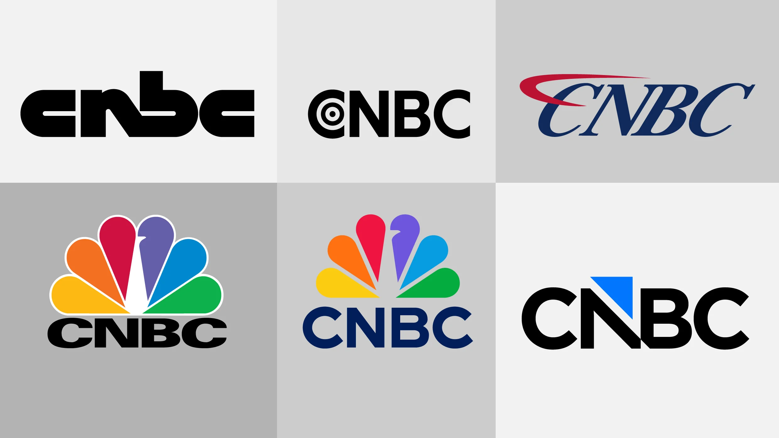
    CNBC’s logo evolution, 1989–present. [Images: CNBC]

    The financial news network’s new logo was designed in house to easily match the preexisting visual assets it uses on air. The typography of the mark based is on the network’s font, Gotham, and it shows a triangle cutting into the letter N and floating just above the wordmark. That triangle, which the network calls an arrow, matches its on-air graphics package.

    The triangle shape has been used by CNBC since 2023. It’s shown next to stocks to indicate which companies are up in green and which are down in red, and it appears as an icon displayed next to on-air chyrons like “Earnings Report.” The colors used in the new logo match the the dark “Broadcast Blue” and light “Neon Blue” already used in the network’s primary color palette.

    The new logo is meant to reflect a modern, streamlined identity, CNBC says, but the initial reaction online to the new logo hasn’t exactly been positive. In one Reddit thread, complaints ranged from “generic” and “corporate-looking” to being bothered by the triangular notch at the bottom of the N and B. “The triangle represents a guillotine blade, killing the brand,” one wrote. On X, a commenter asked if it was a joke.

    Though the peacock is gone, CNBC is betting that by sticking to its arrow and wordmark it will be able to maintain the strength and recognition of its name brand with its audience even with a new look.


    Source link

    Share. Facebook Twitter Pinterest LinkedIn Tumblr Email

    Related Posts

    Wendy’s store closures hit close to 100 locations in franchisee downfall: See the latest list

    November 22, 2026

    7 Best Practices for Vendor Relationship Management

    November 22, 2026

    CrowdStrike CEO: Companies are choosing between getting hacked and shutting down

    November 22, 2026
    Top News
    Business 3 Mins Read

    Why investors should be wary of private equity for the masses

    Business 3 Mins Read

    For most people, it’s natural to assume that if something is exclusive to the wealthiest…

    Free Grocery Stores In NYC?

    February 6, 2026

    NEW: Appeals Court Upholds Biden Judge’s Block on Trump Troop Deployment in Chicago | The Gateway Pundit

    October 17, 2025

    7 Essential Satisfaction Survey Templates You Can Use

    January 31, 2026
    Top Trending
    World Politics 1 Min Read

    Pearl Jam’s Iconic Riff Album Made Fans Wait Two Weeks

    World Politics 1 Min Read

    Thirty-two years ago, Pearl Jam released an album featuring one of rock’s…

    World Politics 1 Min Read

    Dayton Faces Northwestern in Charleston Classic Finale

    World Politics 1 Min Read

    Dayton faced Northwestern in the championship finale of the Charleston Classic, a…

    Business 3 Mins Read

    Wendy’s store closures hit close to 100 locations in franchisee downfall: See the latest list

    Business 3 Mins Read

    The owner of a dwindling empire of Wendy’s restaurants on Friday disclosed…

    Categories
    • Business
    • Economy
    • Headline News
    • Top News
    • US Politics
    • World Politics
    About us

    The Populist Bulletin was founded with a fervent commitment to inform, inspire, empower and spark meaningful conversations about the economy, business, politics, government accountability, globalization, and the preservation of American cultural heritage.

    We are devoted to delivering straightforward, unfiltered, compelling, relatable stories that resonate with the majority of the American public, while boldly challenging false mainstream narratives that seem to only serve entrenched elitists, and foreign interests.

    Top Picks

    Pearl Jam’s Iconic Riff Album Made Fans Wait Two Weeks

    November 22, 2026

    Dayton Faces Northwestern in Charleston Classic Finale

    November 22, 2026

    Wendy’s store closures hit close to 100 locations in franchisee downfall: See the latest list

    November 22, 2026
    Categories
    • Business
    • Economy
    • Headline News
    • Top News
    • US Politics
    • World Politics
    Copyright © 2025 Populist Bulletin. All Rights Reserved.

    Type above and press Enter to search. Press Esc to cancel.